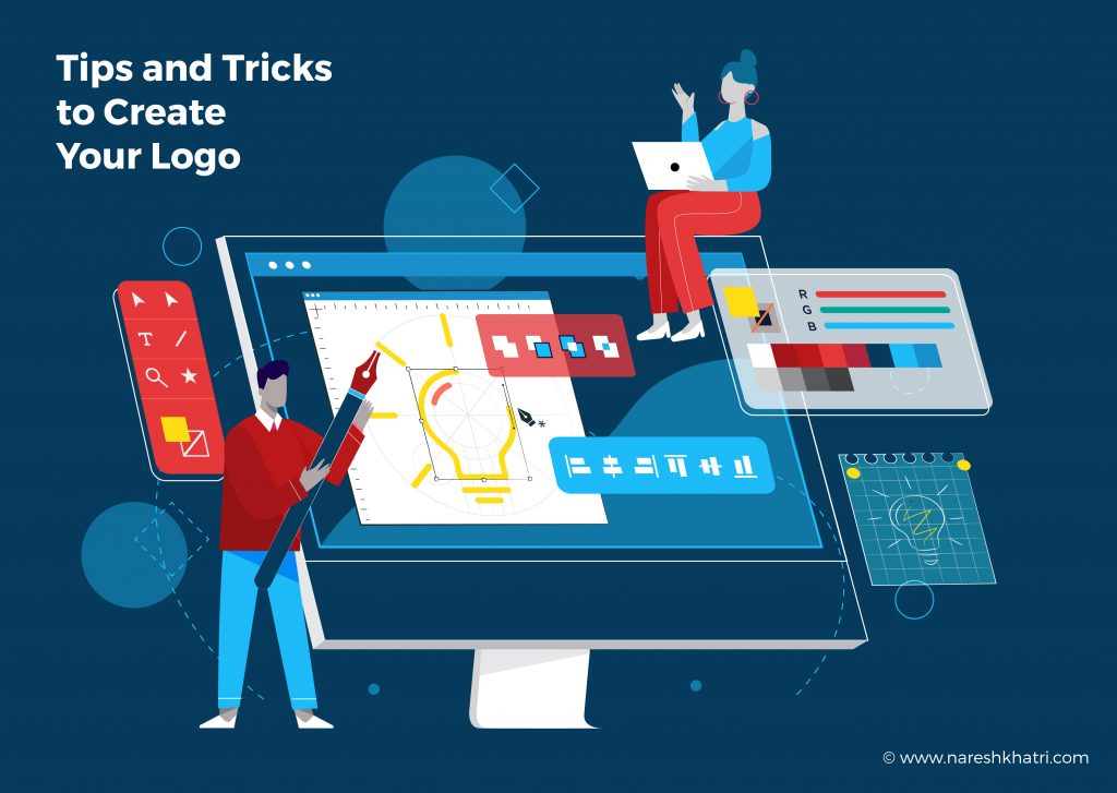
A picture is worth a thousand words, and when it comes to a logo, it represents everything a company or a brand is working on. Designing a great logo may seem complicated, but it can be easy to use a logo design service.
A great logo design is a must for any business and is a cornerstone of any good business brand or even a personal brand. A logo represents who you are and what you do, why you do it, and how you do it. Your logo is included on every social post, presentation decks, marketing materials, business cards and more. It’s unique how much heavy lifting a logo does.
Many people will give you tips and trick you can use to make your logo when it comes to logo creation. Here I’ll let you know the important ones that will surely help you make your logo.
Qualities of a Good Logo
No matter if you’re a beginner or just need a refresh, as most logo design service looks out for, here a few things a good logo should possess:
- It should be eye-catching. Since it’s the first thing most people recognise or memorise, your logo should be eye-catching and not similar to some other symbol. It should be unique on its own.
- A good logo should be timeless. Meaning no matter how old it is, it should be what it represents.
- A logo should be memorable. People should recognise it and what it represents with ease.
- The logo should work well in any size. You may have seen logos printed on different items like stationery products, brochures, flyers and so on.
- And finally, it should encompass your brand vibe. Its colours, design and any words used in a logo should be what your brand represents.
Best Logo Design Tips & Tricks Logo design service
Here are a few best tips and tricks for logo designing:
- A logo is a picture that paints a thousand words. You can be creative with what your brand or company does and design your logo like that.
- Using space to keep your logo design clean is a formula for minimal logo design. Your logo can only use one character that represents your brand.
- Thinking outside of the box is a way most logo designs are created. Using different shapes to represent a logo give it a professional look.
- The Colour of a logo is the key to a good design. The Color of a logo represents your brand’s core values which most people recognise. Plus, a good colour scheme is eye-catching. Here you can also play around to make a visual salience with a pop of colour.
- Being literal or authoritative with your logo is a great way to make your logo recognisable.
- Now you have to remember that you don’t have to reinvent the wheel when designing your logo. Something simple may be just what you need. Like a bakery logo may need wheat on it or just use the word bakery in it. Both work well.
- When it comes to the logo, you don’t be afraid to rejig the wheel. You see, Pepsi has been on the market for over 150 years, and it rejigs its design after a while to keep its brand fresh. A slight change in style may be needed to revamp your brand to new heights.

